Wedding Uplighting Colors: Palette Ideas for Every Theme
Color is the single biggest mood lever you have at a reception. The same room can feel warm and romantic, sleek and modern, or cold and clinical depending entirely on the hue washing the walls. Get the color right and everything — your florals, your dress, your photos — looks better. Here's how to choose.
If you're new to the technique itself — how fixtures are placed, how many you need, wired versus wireless — start with our uplighting explained guide. This page is about the fun part: picking the actual colors. After lighting more than 5,000 events across Middle Tennessee since 1995, we've learned that the right palette is less about your favorite color and more about what flatters the room and the people in it.
Match your uplighting to your wedding palette
The simplest approach is to pull your uplighting color straight from your existing palette — your invitations, your florals, your bridesmaid dresses. But there's a catch: light behaves differently than ink or fabric. A blush pink that looks soft on a swatch can read hot pink on a wall, and a navy that looks elegant on a dress can turn a room cave-dark. The trick is to choose the mood of your palette, then pick a lighting hue that supports it rather than trying to reproduce a fabric color exactly.
- Use your accent color, not your base color: if your palette is ivory, sage, and gold, light the room in soft gold or warm white — not sage, which can read sickly on skin.
- Think 80/20: wash most of the room in a flattering neutral and reserve any bold color for a feature wall, the bar, or behind the head table.
- Bring us a swatch: our RGBW fixtures can match a real color, so a sample beats a description every time.
The most flattering colors
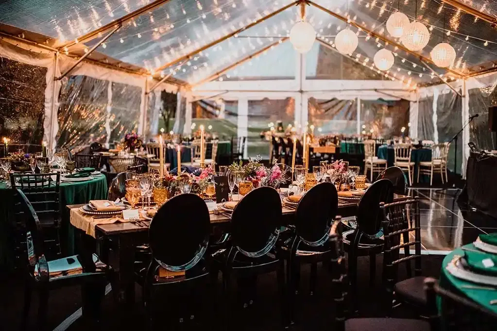
If you remember one thing from this guide, make it this: warm tones flatter people, cool tones flatter rooms. Warm amber and soft blush sit in the same part of the spectrum as candlelight and golden-hour sun — the light everyone already looks good in. They add a healthy glow to every skin tone and make food look appetizing.
Amber is our most-requested color for exactly this reason, and it's the safest choice for the dinner portion of the night. Blush and soft rose are close behind — romantic without being heavy. These hues also photograph beautifully, because your photographer's camera is calibrated for warm light and skin tones.
The warning that comes with this: deep, saturated blue and red can turn unflattering fast. A wall of intense blue casts a cold tint on faces and makes a plated dinner look gray. Heavy red can read garish and tire the eyes over a long evening. None of this means you can't use them — it means use them as accents, on architecture or a dance floor, not as the blanket color over your guests during dinner.
Color ideas by season
Letting the season guide your palette keeps everything cohesive with your florals and the light coming through the windows.
- Spring: soft blush, lavender, pale peach, and warm white. Light, airy hues that echo garden florals without overpowering the room.
- Summer: warm amber, soft coral, and champagne gold for an open, golden-hour feel; cooler aqua or seafoam works well for coastal or tented receptions.
- Fall: amber, terracotta, deep gold, and warm copper. This is amber's home season — rich, candlelit, and forgiving in a barn or rustic venue.
- Winter: warm white with subtle icy-blue accents, plum, or deep emerald for a jewel-toned, intimate feel. Keep the blues light so the room stays inviting.
Color ideas by theme and aesthetic
- Classic & elegant: warm white or soft champagne gold. Timeless, never dates, and lets florals and linens lead.
- Romantic blush: soft pink and rose with a touch of amber — dreamy and feminine, gorgeous in photos.
- Moody & modern: deep amber or a controlled accent of plum or sapphire on feature walls, with the rest of the room kept dim and warm.
- Rustic barn: amber and warm gold to play up wood beams and string lights — it makes natural materials glow.
- Garden & greenery: warm white and soft peach. Resist the urge to light greenery in green light; warm tones keep foliage looking lush instead of artificial.
- Glam & high-energy: champagne and gold for dinner, then a shift to a saturated brand or accent color when the dance floor opens.
How lighting color interacts with your venue walls
This is the step most couples miss. Uplighting is colored light landing on a colored surface, and the wall color changes the result. A pure-white ballroom shows colors most accurately. Beige, cream, or tan walls warm up and mute cool colors — your icy blue may land grayish-green. Dark or wood walls drink up light, so you'll need richer, brighter colors and often more fixtures to register at all. Brick and stone add their own warm tint. Always tell us your venue and wall finish; we factor it in before we promise a color. For barns, hotels, and ballrooms across the region, see our wedding lighting services.
Warm white: the safe default
When in doubt, choose warm white. It does what most couples actually want from uplighting — it adds depth, draws the eye to architecture, and makes the room feel finished and intentional — without committing to a bold statement. It flatters everyone, never clashes with florals, and ages well in photos you'll look at for decades. Many of our weddings run warm white or amber all night and look stunning; color is an option, not a requirement.
Matching a Pantone or hex code
Modern RGBW fixtures mix red, green, blue, and a dedicated white diode, which lets us dial in a specific shade rather than the handful of presets older lights offered. Bring us a Pantone number, a hex code, or a physical swatch and we'll match it as closely as light physics allows. The honest caveat: a saturated swatch under your kitchen light won't look identical projected ten feet up a beige wall — but we'll get you in the right family and adjust on site. If you're also considering a custom monogram in your colors, our gobo and monogram projection guide covers that.
Colors to avoid and common mistakes
- Harsh green: almost universally unflattering — it casts a sickly tint on skin. If you want greenery to read, use warm white on real foliage instead.
- Too-saturated everything: a fully blue or magenta room reads like a nightclub, not a wedding, and kills the elegance. Saturated color belongs on accents, not the whole space.
- Changing colors during dinner: rotating or shifting colors while people eat is distracting and unflattering to the food. Save the color change for the dance floor.
- Ignoring the photographer: heavy colored light is hard to correct in post. If your photos matter most, lean warm for the toasts and first dance.
- Forgetting the budget trade-off: more colors and feature moments mean more fixtures. Our wedding lighting cost guide breaks down what drives the price.
Frequently asked questions
What is the most popular wedding uplighting color?
Warm amber, by a wide margin. It mimics candlelight, flatters every skin tone, suits nearly any décor, and photographs beautifully. Soft blush and warm white are close runners-up.
Can you change uplighting colors during the reception?
Yes. RGBW fixtures shift on cue, so a common plan is warm amber for dinner and a switch to your accent color when the dance floor opens. We program the changes to happen smoothly at the right moments.
Does uplighting color affect my photos?
Significantly. Warm ambers and blush tones make skin glow on camera; heavily saturated blues, reds, and greens cast colored light on faces and food that's hard to correct, so we use them as accents rather than blanket the room.
See your colors in your venue
Send us your venue and a swatch of your palette and we'll recommend colors that flatter the room — with a free quote within 24 hours.
Get My Free Quote